
| ☰ See All Chapters |
JSX Rules in ReactJS
Rule 1: Wrapping JSX inside parentheses
If JSX spans multiple lines, you’ll need to wrap the expression in parentheses. If you have only one line then using parentheses to wrap the code is optional. In the below example we have only one line of JSX code where using parentheses is now optional.
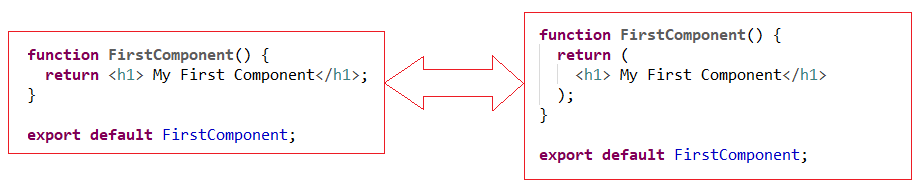
If JSX spans multiple lines then JSX must be wrapped inside parentheses.
Rule 2: Nested Components
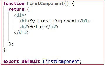
When you return JSX from a function or statement, you must return a single element. That element may have nested children, but there must be a single top-level element.
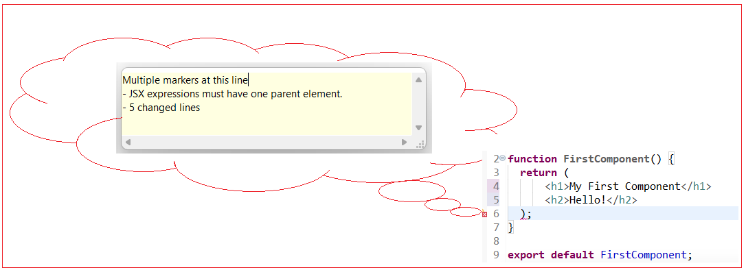
In case if you do not have a parent element you fix the using a small code change. Surround the code with an empty tag. An empty tag is an HTML element without any words. It looks like this: <> </> .
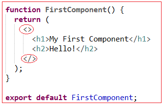
The empty tag creates a single element, but when the code is compiled, it is not added to the final markup. This will keep your code clean while still giving React a single element. You could have also wrapped the code with a div instead of empty tags, as long as the code returns one element. In this example, an empty tag has the advantage of not adding extra markup to the parsed output.
Rule 3: Element Differences in attributes
className
Let us import css from an external css file to our component.
firstreactproject/src/components/firstcomponent.css
.container { display: flex; flex-direction: column; align-items: center; color: red; } |
JSX slightly diverge from HTML while applying the CSS to your elements. If you wanted to add a class to a usual HTML element you would do it like this:
<div class="container">
But since JSX is JavaScript, it has a few limitations. One of the limitations is that JavaScript has reserved keywords. That means you can’t use certain words in any JavaScript code. For example, you can’t make a variable called null because that word is already reserved. One of the reserved words is class. React gets around this reserved word by changing it slightly. Instead of adding the attribute class, you will add the attribute className. As a rule, if an attribute is not working as expected, try adding the camel case version. Another attribute that is slightly different is the for attribute that you’d use for labels.
firstreactproject/src/components/firstcomponent.js
import './firstcomponent.css';
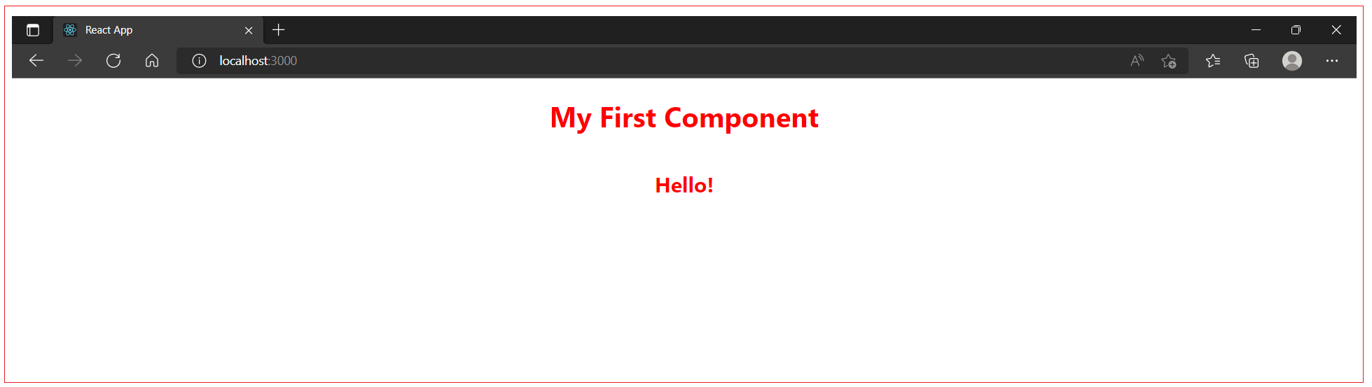
function FirstComponent() { return ( <div className = "container"> <h1>My First Component</h1> <h2>Hello!</h2> </div> ); }
export default FirstComponent; |
Save the file. When you do, the page will reload and the content will be centered and will be in red.
The className attribute is unique in React. You can add most HTML attributes to JSX without any change. As an example, go back to your text editor and add an id of myId to your <h1> element. It will look like standard HTML:
firstreactproject/src/components/firstcomponent.js
import './firstcomponent.css';
function FirstComponent() { return ( <div className="container"> <h1 id="myId">My First Component</h1> <h2>Hello!</h2> </div> ); }
export default FirstComponent; |
defaultChecked
The checked attribute is supported by <input> components of type checkbox or radio. You can use it to set whether the component is checked. This is useful for building controlled components. defaultChecked is the uncontrolled equivalent, which sets whether the component is checked when it is first mounted.
dangerouslySetInnerHTML
dangerouslySetInnerHTML is React’s replacement for using innerHTML in the browser DOM. In general, setting HTML from code is risky because it’s easy to inadvertently expose your users to a cross-site scripting (XSS) attack. So, you can set HTML directly from React, but you have to type out dangerouslySetInnerHTML and pass an object with a __html key, to remind yourself that it’s dangerous. For example:
function FirstComponent() { return <div dangerouslySetInnerHTML={createMarkup()} />; }
function createMarkup() { return {__html: 'First · Second'}; }
export default FirstComponent; |
htmlFor
Since for is a reserved word in JavaScript, React elements use htmlFor instead.
selected
In HTML, <select> creates a drop-down list. For example, this HTML creates a drop-down list of flavors:
<select> <option value="grapefruit">Grapefruit</option> <option value="lime">Lime</option> <option selected value="coconut">Coconut</option> <option value="mango">Mango</option> </select> |
Note that the Coconut option is initially selected, because of the selected attribute. React, instead of using this selected attribute, uses a value attribute on the root select tag. This is more convenient in a controlled component because you only need to update it in one place. For example:
<select value="coconut"> <option value="grapefruit">Grapefruit</option> <option value="lime">Lime</option> <option value="coconut">Coconut</option> <option value="mango">Mango</option> </select> |
Style
The style attribute does not support a CSS string.
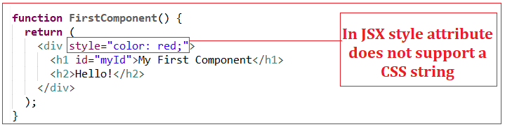
The style attribute accepts a JavaScript object with camelCased properties rather than a CSS string. This is consistent with the DOM style JavaScript property, is more efficient, and prevents XSS security holes. For example:
Style keys are camelCased in order to be consistent with accessing the properties on DOM nodes from JS. For example, in HTML we can use style keys as below:
<div style="align-items: center; flex-direction: column">
</div> |
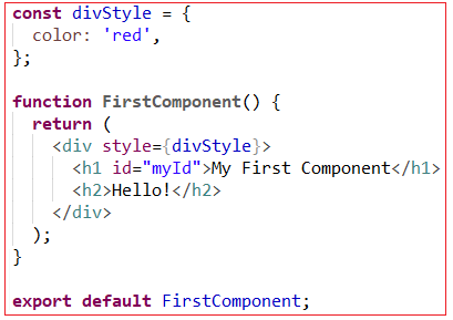
Same in JSX can be used as below:
const divStyle = { color: 'red', alignItems: 'center', flexDirection: 'column', display: 'flex', };
function FirstComponent() { return ( <div style={divStyle}> <h1 id="myId">My First Component</h1> <h2>Hello!</h2> </div> ); }
export default FirstComponent; |
React will automatically append a “px” suffix to certain numeric inline style properties. If you want to use units other than “px”, specify the value as a string with the desired unit. For example:
// Result style: '10px' <div style={{ height: 10 }}> Hello World! </div>
// Result style: '10%' <div style={{ height: '10%' }}> Hello World! </div> |
Not all style properties are converted to pixel strings though. Certain ones remain unitless (eg zoom, order, flex). A complete list of unitless properties can be seen here.
suppressContentEditableWarning
Normally, there is a warning when an element with children is also marked as contentEditable, because it won’t work. This attribute suppresses that warning. Don’t use this unless you are building a library like Draft.js that manages contentEditable manually.
suppressHydrationWarning
If you use server-side React rendering, normally there is a warning when the server and the client render different content. However, in some rare cases, it is very hard or impossible to guarantee an exact match. For example, timestamps are expected to differ on the server and on the client.
If you set suppressHydrationWarning to true, React will not warn you about mismatches in the attributes and the content of that element. It only works one level deep, and is intended to be used as an escape hatch. Don’t overuse it. You can read more about hydration in the ReactDOM.hydrateRoot() documentation.
value
The value attribute is supported by <input>, <select> and <textarea> components. You can use it to set the value of the component. This is useful for building controlled components. defaultValue is the uncontrolled equivalent, which sets the value of the component when it is first mounted.
Rule 4: JavaScript Expressions
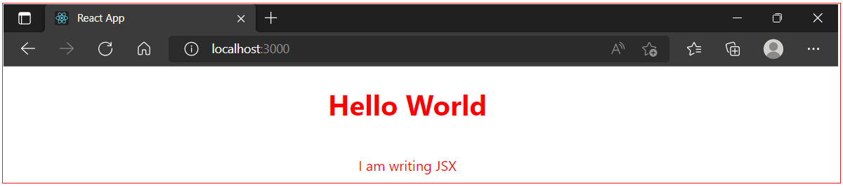
Power of JSX comes with JavaScript even though it looks like HTML. That means you can assign variables and reference them in your attributes. JavaScript expressions are wrapped in curly braces and indicate where variables will be evaluated and their resulting values returned. For example, if we want to display the value of the message property in an element, we can insert that value using a JavaScript expression. The variable will be evaluated and its value returned. Also when we have to attach the id of an element dynamically from JavaScript we bind the id attribute to JavaScript expression as below:
function FirstComponent() { const elementId = "myId"; const message = "Hello World"; return ( <div className="container"> <h1 id={elementId}>{message}</h1> <p>I am writing JSX</p> </div> ) }
export default FirstComponent; |
The JavaScript that’s added in between the curly braces will get evaluated. This means that operations such as concatenation or addition will occur. This also means that functions found in JavaScript expressions will be invoked:
<h1>{"Hello" + title}</h1>
<h1>{title.toLowerCase().replace}</h1>
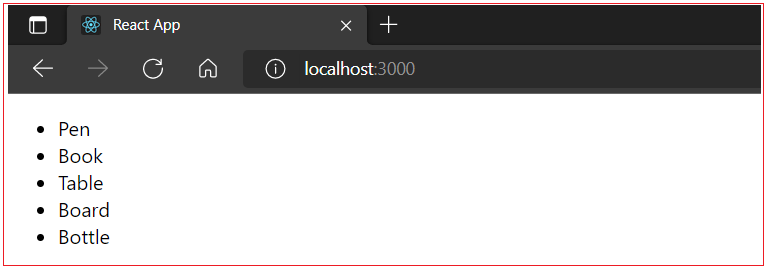
JSX is JavaScript, so you can incorporate JSX directly inside of JavaScript functions. For example, you can map an array to JSX elements:
function FirstComponent() { const items = ['Pen', 'Book', 'Table', 'Board', 'Bottle']; return ( <div> <ul> {items.map((item, i) => ( <li key="{i}">{item}</li> ))} </ul> </div> ) }
export default FirstComponent; |
Rule 5: Adding Events to Elements
In JSX JavaScript code is coupled with your markup, you can quickly add the events while keeping your code well-organized. JSX uses slightly different camelCased names for element.
function FirstComponent() { return ( <button id="myID" onClick={event => alert(event.target.id)} >Click Here</button> ) } export default FirstComponent; |
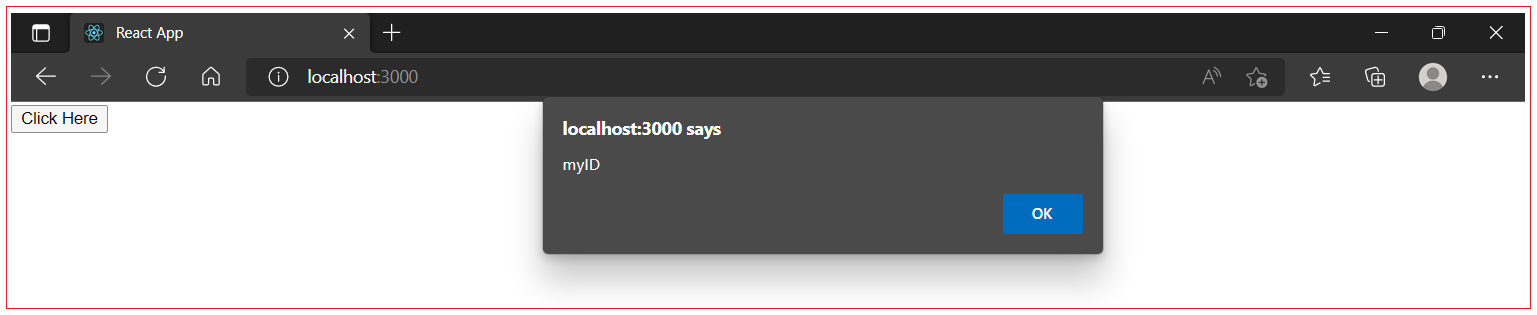
Since this is JSX, you camelCased onclick, which means you added it as onClick . This onClick attribute uses an anonymous function to retrieve information about the item that was clicked. Same in HTML can be written as below:
<!DOCTYPE html> <html>
<script> function test(event) { alert(event.target.id); } </script>
<body> <button id="myID" onclick="test();">Click Here</button> </body>
</html> |
Instead of using anonymous function you can declare it outside the main component function. In other words, the function does not need to access the scope of the component. The advantage to keeping them separate is that your component function is slightly shorter and you could move the function out to a separate file later if you wanted to. React event handlers are written inside curly braces. onClick={displayIdOfElemennt} instead of onclick="displayIdOfElemennt"
function FirstComponent() { const displayIdOfElemennt = event => alert(event.target.id); return ( <button id="myID" onClick={displayIdOfElemennt} >Click Here</button> ) }
export default FirstComponent; |
Passing Arguments to event handlers
To pass an argument to an event handler, use an arrow function.
function HelloComponent() { const testOnclickEvent = (message, event) => {alert(event.target.id); alert(message);} return ( <button id="myID" onClick={(event) => testOnclickEvent("HelloWorld", event)} >Click Here</button> ) }
export default HelloComponent; |
Event handlers have access to the React event that triggered the function. Passing the event argument is not needed when we have no parameters in function. But when there are parameters set in the function and event argument also to be used in function then event argument should be a parameter in function.
Rule 6: Mapping Over Data to Create Elements
JSX is JavaScript, so you can incorporate JSX directly inside of JavaScript functions. You tried this a little already by passing functions to attributes. You also used variables to reuse data. Now it’s time to create JSX directly from data using standard JavaScript code. For example, you can map an array to JSX elements:
function FirstComponent() { const items = ['Pen', 'Book', 'Table', 'Board', 'Bottle']; return ( <div> <ul> {items.map((item, i) => ( <li key="{i}">{item}</li> ))} </ul> </div> ) }
export default FirstComponent; |
To do this, you’ll map over the data and return a JSX element. There are a few things you’ll need to keep in mind as you write the code.
Group of items needs to be surrounded by a container <div>
Every item needs a special property called key. The key needs to be a unique piece of data that React can use to keep track of the elements so it can know when to update the component. The key will be stripped out of the compiled HTML, since it is for internal purposes only. Whenever you are working with loops you will need to add a simple string as a key.
The resulting HTML for above component would look like this:
<div> <ul> <li>Pen</li> <li>Book</li> <li>Table</li> <li>Board</li> <li>Bottle</li> </ul> </div> |
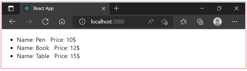
Below we have another example of mapping an array objects to JSX elements:
function FirstComponent() { const ietms = [ { name: 'Pen', price: "10$" }, { name: 'Book', price: "12$" }, { name: 'Table', price: "15$" } ]; return ( <div> <ul> { ietms.map(ietm => ( <li key={ietm.name}> Name: <span id={ietm.name}>{ietm.name}</span> Price: <span id={ietm.price}>{ietm.price}</span> </li> )) } </ul> </div>
) }
export default FirstComponent; |
Rule 7: Conditionally Showing Elements
To conditionally display certain HTML elements, you can use Boolean value to make the decision. You can hide or show HTML based on additional information giving your components flexibility to handle multiple situations. To display elements conditionally use a Conditional operand as first part of the expression, and if the first part is truthy, it will return the information in the second part.
function FirstComponent() { const displayBlock1 = true; const displayBlock2 = false; return ( <div> {displayBlock1 && <h1> I am Block 1</h1>} {displayBlock2 && <h1> I am Block 2</h1>} </div> ) }
export default FirstComponent; |
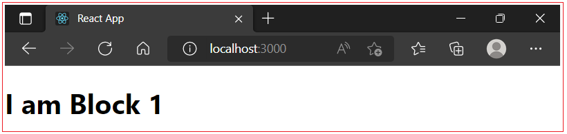
In this example, you are using the && operator, which returns the last value if everything is truthy. Otherwise, it returns false, which will tell React to return no additional markup. Removed elements are also not appear in the generated HTML. This is not the same as hiding an element with CSS. It won’t exist at all in the final markup. In our example the value of Boolean variable is hard-coded, but you can set the value dynamically or store that value as a state or pass it as a prop from a parent component.
All Chapters
