| ☰ See All Chapters |
Angular Components - @Component
Angular 2 applications are component-driven. Angular components are simply web components coded as TypeScript modules, where web component is a custom HTML tag whose appearance and behavior is kept separate from the rest of the application. Any TypeScript class which is decorated with angular @Component annotation is a component. This annotation marks the class as a component class and declares the component behavior for Angular framework. You will completely understand components only after you complete reading many more chapters.
There are many field available in @Component annotation, below are the three import fields available in @Component
selector
template
styles
Example:
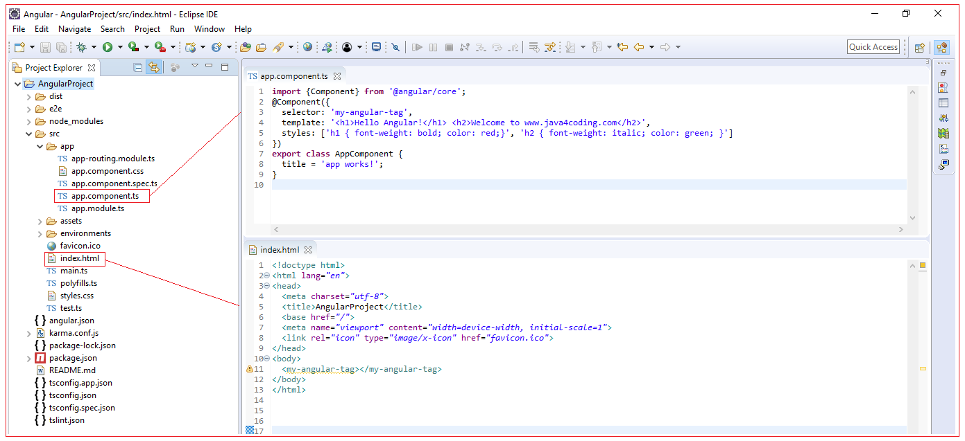
import {Component} from '@angular/core'; @Component({ selector: 'my-angular-tag', template: '<h1>Hello Angular!</h1> <h2>Welcome to www.java4coding.com</h2>', styles: ['h1 { font-weight: bold; color: red;}', 'h2 { font-weight: italic; color: green; }'] }) export class AppComponent { title = 'app works!'; } |
Because of the export keyword, the compiler recognizes this as a module. After the module is compiled, it can be inserted into a page with the <my-angular-tag> tag. We have used this tag in our index.html.
<!doctype html> <html lang="en"> <head> <meta charset="utf-8"> <title>AngularProject</title> <base href="/"> <meta name="viewport" content="width=device-width, initial-scale=1"> <link rel="icon" type="image/x-icon" href="favicon.ico"> </head> <body> <my-angular-tag></my-angular-tag> </body> </html> |

When this is launched you will see as below:

Component selector
Identifies the name of the custom HTML element corresponding to the component. The below component will be identified by my-angular-tag. When you write the tag <my-angular-tag></my-angular-tag> in your html you will get the html display of <h1>Hello Angular!</h1> <h2>Welcome to www.java4coding.com</h2> displayed in that place.
@Component({ selector: 'my-angular-tag', template: '<h1>Hello Angular!</h1> <h2>Welcome to www.java4coding.com</h2>', styles: ['h1 { font-weight: bold; color: red;}', 'h2 { font-weight: italic; color: green; }'] }) |
The tag's name should meet the four requirements
May contain letters, digits, dots, hyphens, and underscores
Can't contain uppercase letters
Can't conflict with existing elements or CSS properties
Must contain at least one hyphen
The name of the tag and the name of the class don't need to be related in any way.
Component template
A component's template defines its appearance and internal structure, contains the component's HTML template
If the template's HTML requires multiple lines, the quotes around the HTML can be replaced with backticks (``). This is shown in the following template definition:
template: `<h1> Hello Angular! </h1> <h2> Welcome </h2>`, |
A component's template can also be specified by a templateUrl field. This provides the location of a resource that contains the template's HTML. In many cases, this is a local HTML file. For example, the following field states that the component's template can be found in the template.html file.
templateUrl: 'welcome.html' |
Component style
A component's style defines the styles for our template.
Style for our template can also be specified using styleUrls field. The styleUrls tells Angular, where to find the CSS File. This property points to external css file. styleUrls can accept multiple CSS Files.
styleUrls: ['angularStyles.css', 'mystyles.css'] |
We can also define css class directly as show below.
@Component({ selector: 'my-angular-tag', template: '<h1>Hello Angular!</h1> <h2>Welcome</h2>', styles: ['h1 { font-weight: bold; color: red;}', 'h2 { font-weight: italic; color: green; }'] }) |
All Chapters

